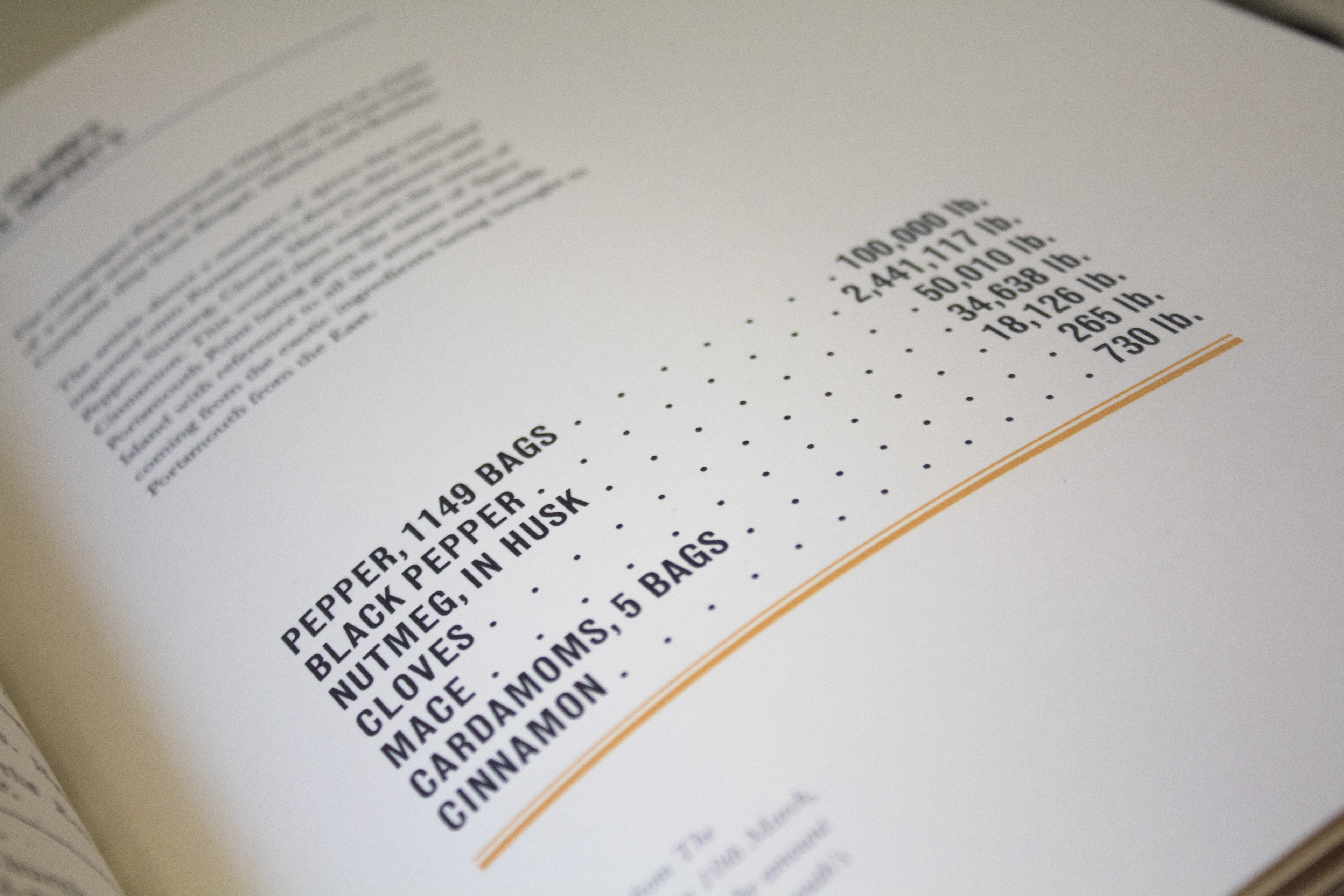
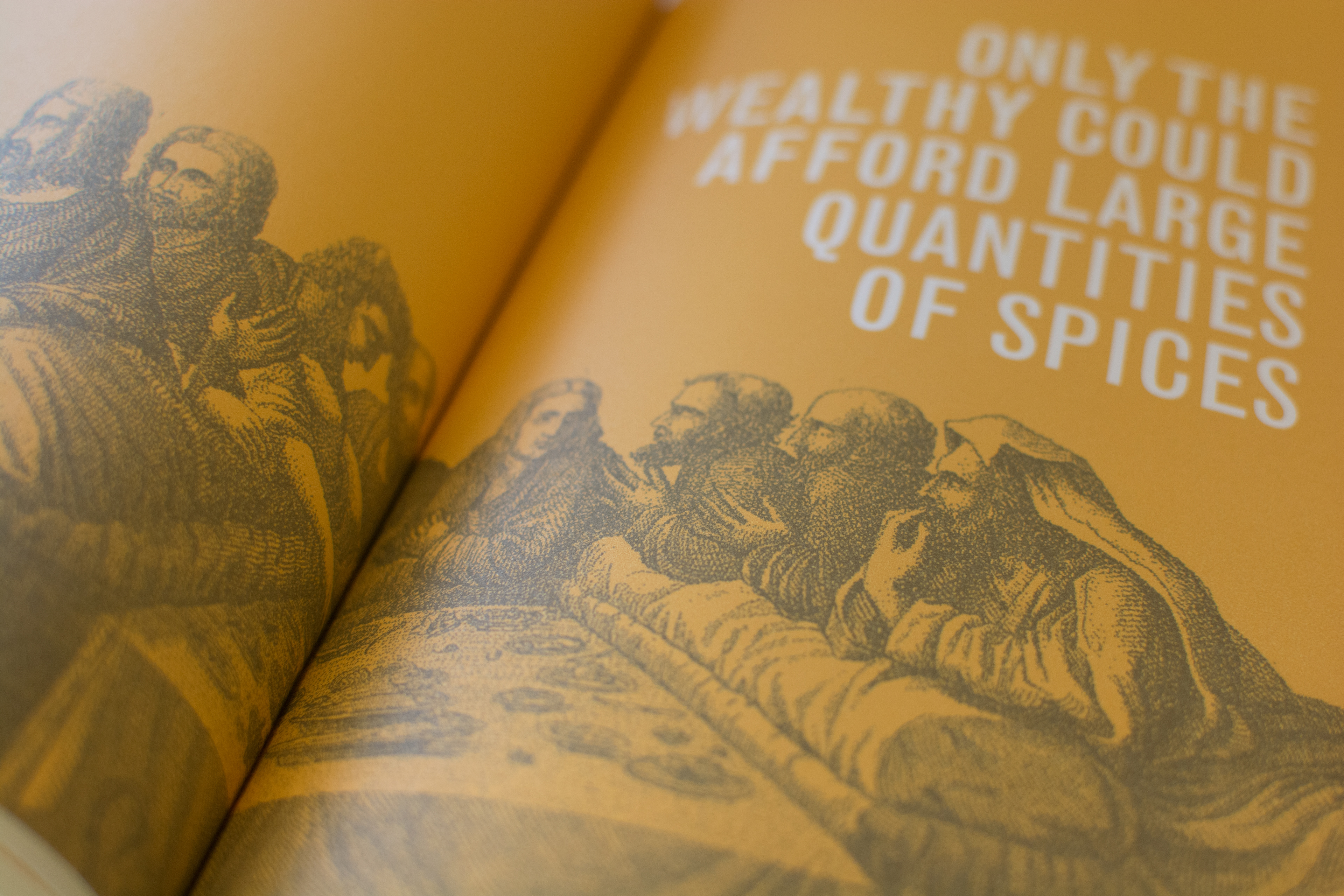
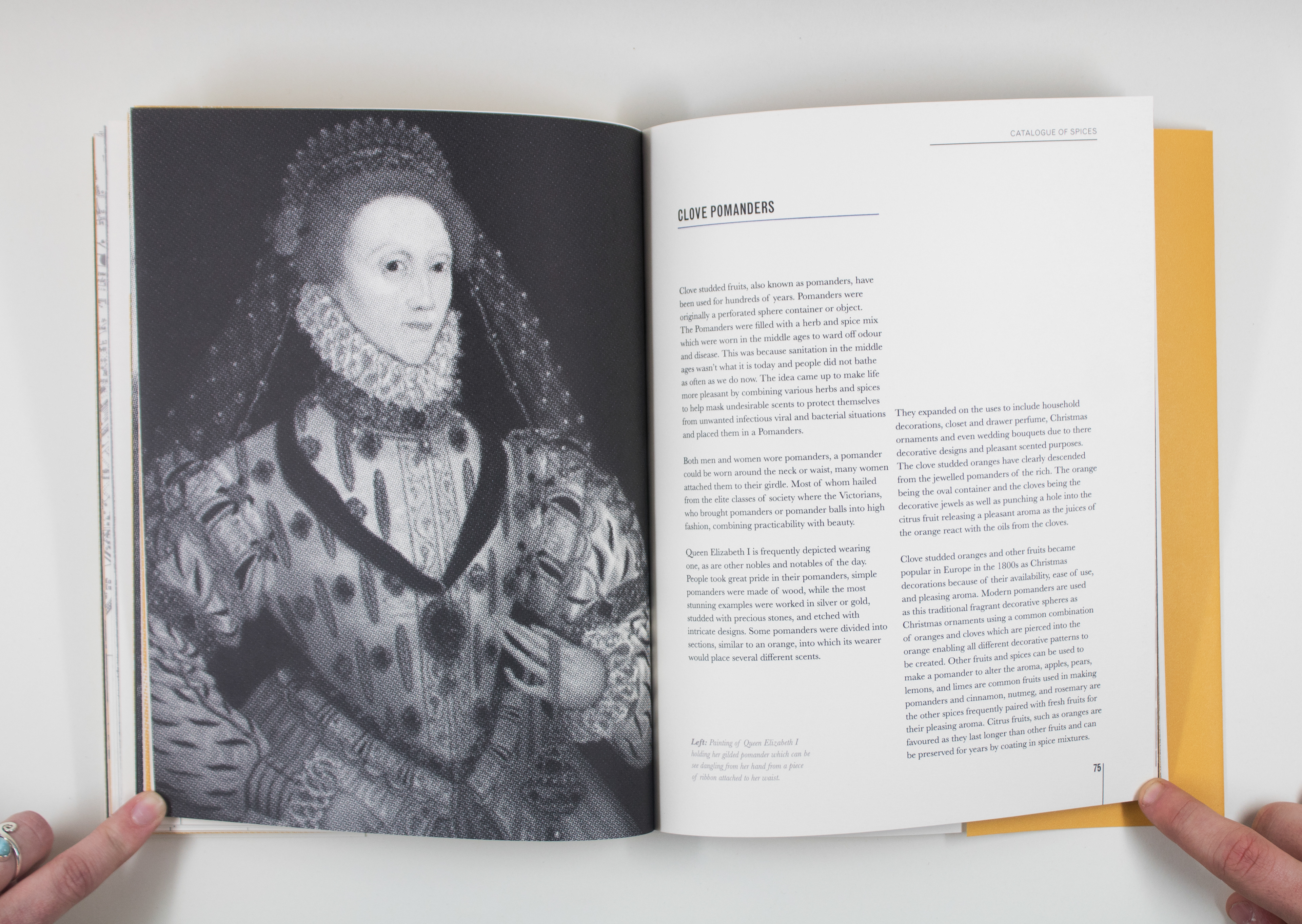


Spices have a long history at the forefront of Britain’s Age of Exploration, once a very rare and expensive commodity they’ve now become a common ingredient within our kitchens due to the multicultural society we now live in. Spices from all over the world can now be obtained and used anywhere on the planet with the help from the spice traders of The English East India Company who’ve influenced Britain’s dining tables by bringing these exotic ingredients to our shores. Inspired by the ‘Food for Thought’ brief I wanted to highlight the shocking and brutal history that surrounded the spice trade. Having chosen my topic, I wanted to create a traditional book, using carefully selected typefaces to provide the audience with professional, informative information about the surprising history of spices. The general idea behind the design of the book was to modernise the traditional outlook of spices. To me, when you talk about spices my mind refers back to very traditional, cultural foods and dishes rich in history. Despite the modern layout, it was important to me and the history of spice trade that the written elements remained as traditional as possible. The traditional outlook has been helped by my selection of the Baskerville and Monotype grotesque typefaces which originated from traditional English letter pressing style. Throughout the book I’ve used a strict modular grid system making it easy for any audience to read and understand. I have used complementary imagery throughout the book to help visually support the content and help the reader’s understand the information. I feel that the bold San Serif of the Monotype Grotesque type face contrasts well with the delicate line and halftone images. The book is based around a complementary black and yellow colour theme. In my opinion, the chosen colour yellow visualises the warm flavours of the spices whilst not distracting the reader from the information.